
Capital One had the infrastructure of America's #8 bank and the ambition of a tech company. Engaged as a freelance consultant across two separate engagements (2016–2017, then again in 2019). I led research-driven design strategy across SMB (small and medium-sized business) banking, mobile T&E (travel and expense), virtual card, and the Capital One Café. I also contributed to Project Elements, a radical reimagining of the credit card.
Research that grounded a platform I helped design and ship.
The 2016–2017 engagement split into two connected workstreams. One was deep-dive research into how small businesses actually handle travel and expense. The other was the information architecture, design system, and interface work for ICCE Web, Capital One's unified virtual payments platform. Alongside that, I contributed to Project Elements, Capital One Labs' radical reimagining of the credit card. Pick a track below, or read all three.
Building the research program from the ground up
We built the Mobile T&E research effort from nothing. A cross-functional team: product management, design, research, content strategy, analytics. Planning and recruiting. Scripted interviews. Grassroots exercises with Capital One associates. Journey mapping, competitive analysis against Expensify, Concur, and eBillity, then solution ideation sessions.
For the ICCE (Integrated Commercial Card Experience) initiative, I led 20+ in-person empathy interviews with small business owners, plus phone interviews with existing Virtual Card customers and 6 taped webcam sessions for remote validation. It ran across multiple full-day sessions and geographies. Recruiting deliberately cast a wide net across industry, company size, and how hands-on an owner was with day-to-day spend, so the sample wouldn't just reflect whoever was easiest to reach.
The same themes surfaced in almost every interview. People building their own workarounds because the official process couldn't keep up. Heavy manual data entry. Rules communicated ad hoc instead of made clear upfront. And a surprising amount of emotional weight tied to simply being trusted with a corporate card. One line from an interview stuck with the whole team:
I didn't get into this job to submit expense reports.
Mapping the full life of a small business owner
From this research I built a comprehensive Ecosystem Concept Model: every task a small business owner performs, at every cadence from daily to annual, mapped against their internal attitudes and external relationships (bank, employees, vendors, accountant). Laying it out radially, by cadence rather than by feature or workflow, is what made it useful. It showed how rarely "do my expenses" was ever the actual job someone showed up to do. Almost all of the real T&E burden was squeezed into the cracks between higher-priority work.
This radial model became the foundation for SMB product strategy, and multiple product teams adopted it. It gave them a shared reference for where a feature idea actually sat in a small business owner's week, rather than in an internal roadmap category.
Three archetypes, one wide trust spectrum
Key insights surfaced three user archetypes: ICCE Mobile (T&E), Virtual Card Users, and Decision Makers, each translated into driving principles that moved insights directly into planning. The personas behind them spanned a wide trust spectrum. A Director of IT who ties his sense of being respected to getting his expense report right every time. And a tile installer with no corporate card at all, fronting her own money, losing hours a month to receipts in a folder in her truck. Serving that whole range, not just the average case, was the design constraint every downstream decision had to answer to.
Shipping Capital One T&Easy
The archetypes translated straight into a features roadmap. OCR (optical character recognition) to auto-capture receipt data. Auto-generated expense reports tied to the billing cycle instead of a monthly scramble. Both built so the tile installer fronting her own money and the Director of IT protecting his reputation could get what they needed from the same product.
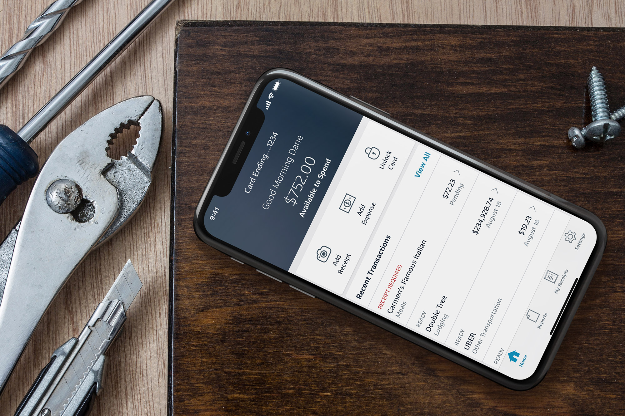
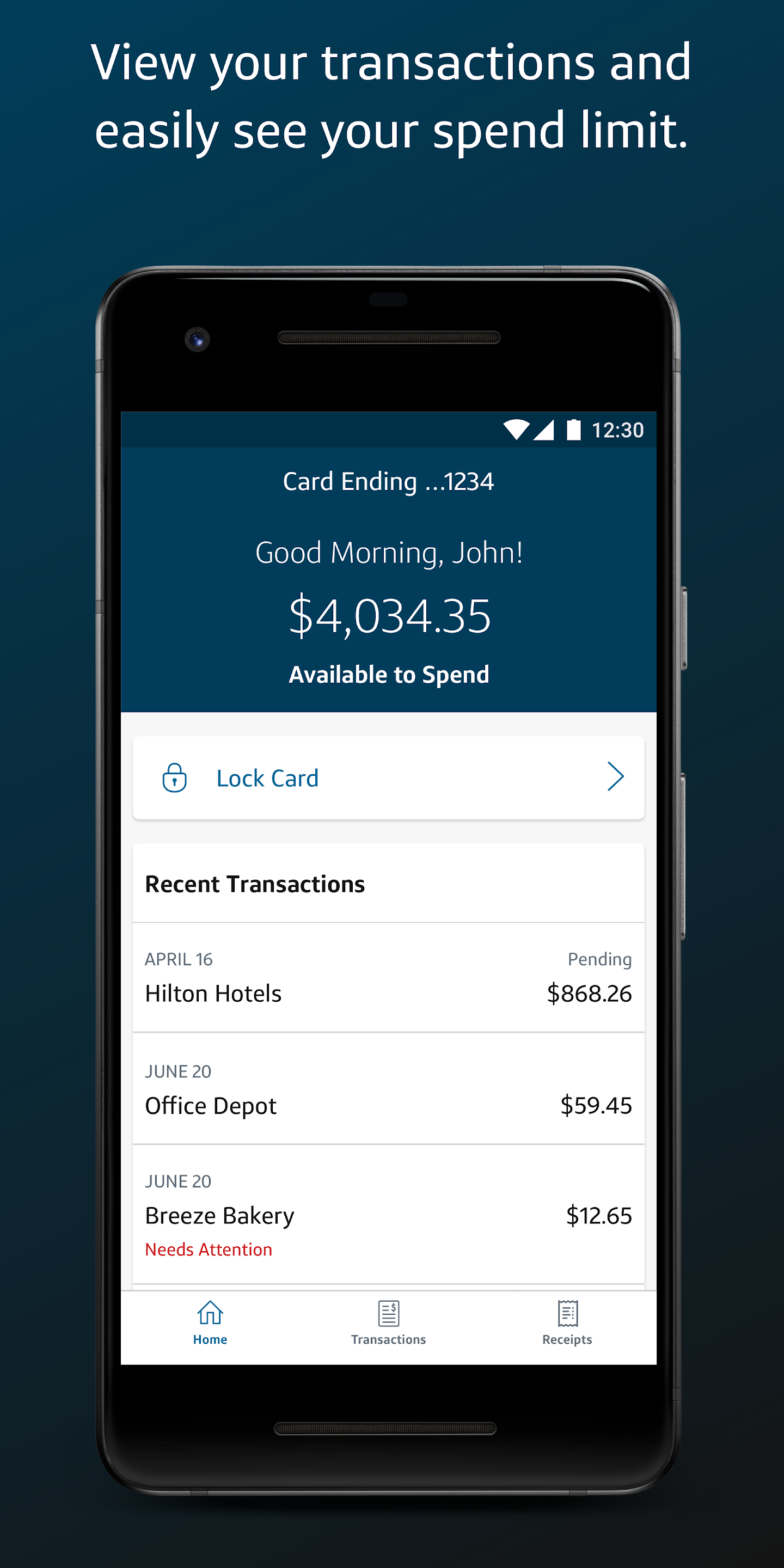
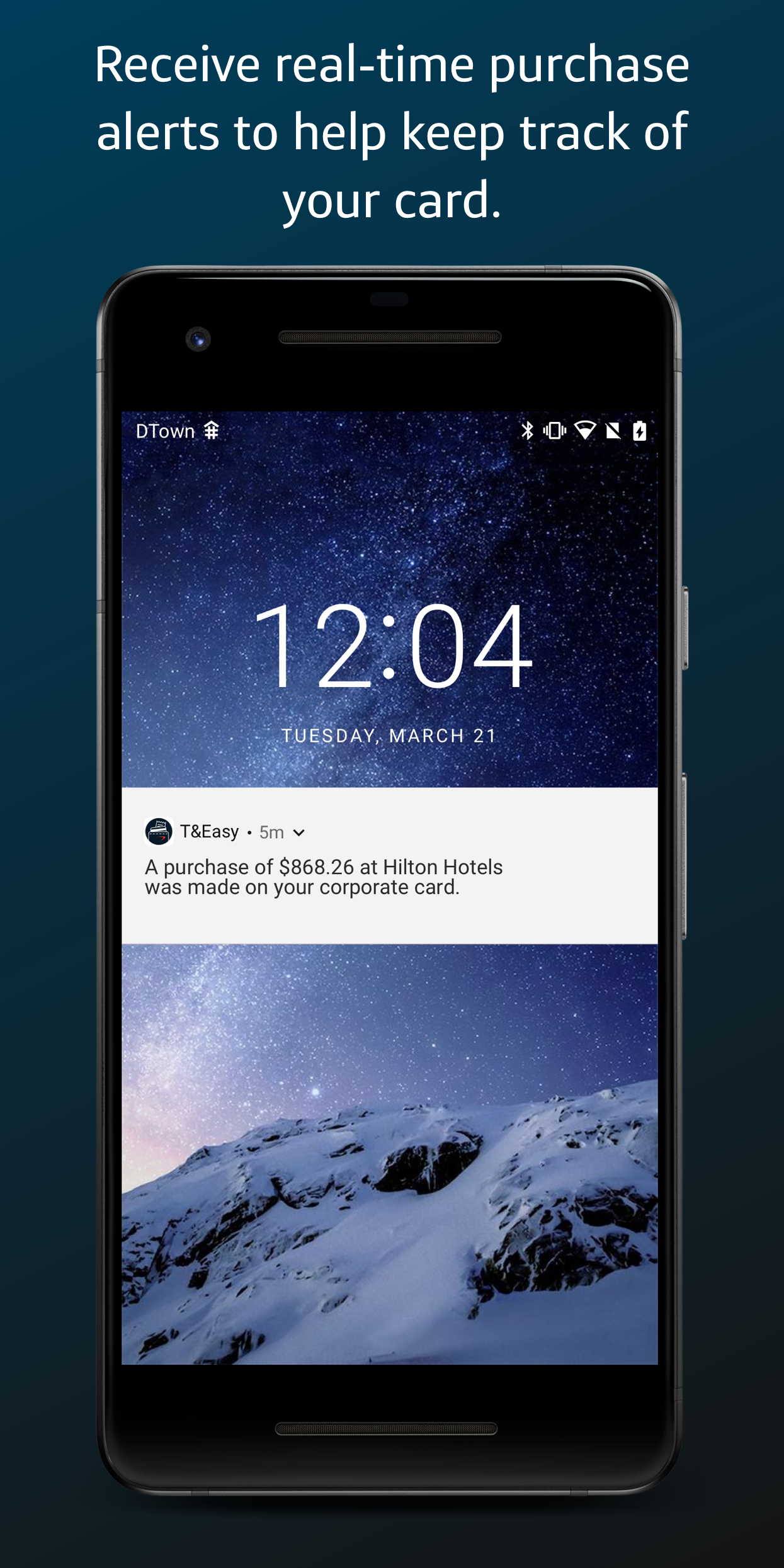
That direction shipped as Capital One T&Easy, the corporate cardholder app. Balance and spend-limit visibility, locking or unlocking a card on the spot, transaction notifications, expense capture on the go: a mobile-first answer to almost everything the research had surfaced. 📱
The same mobile foundation, still shipping today
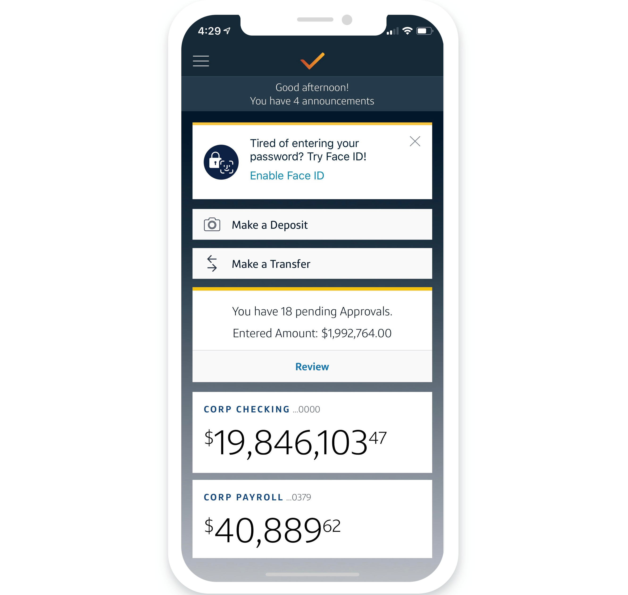
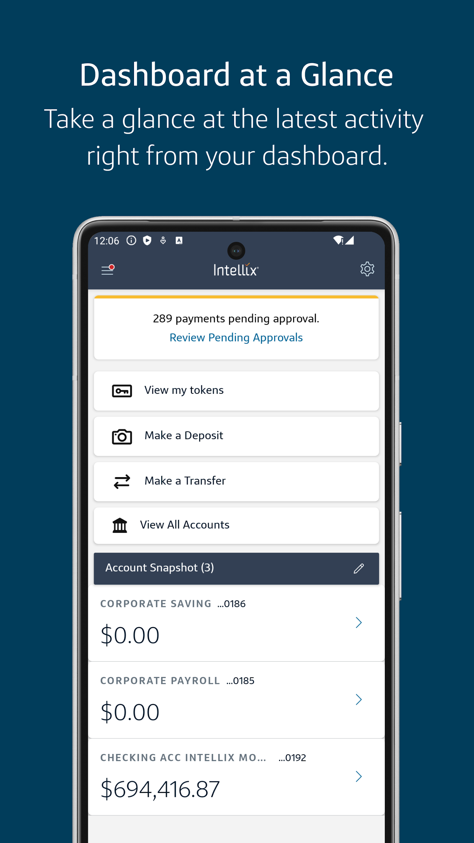
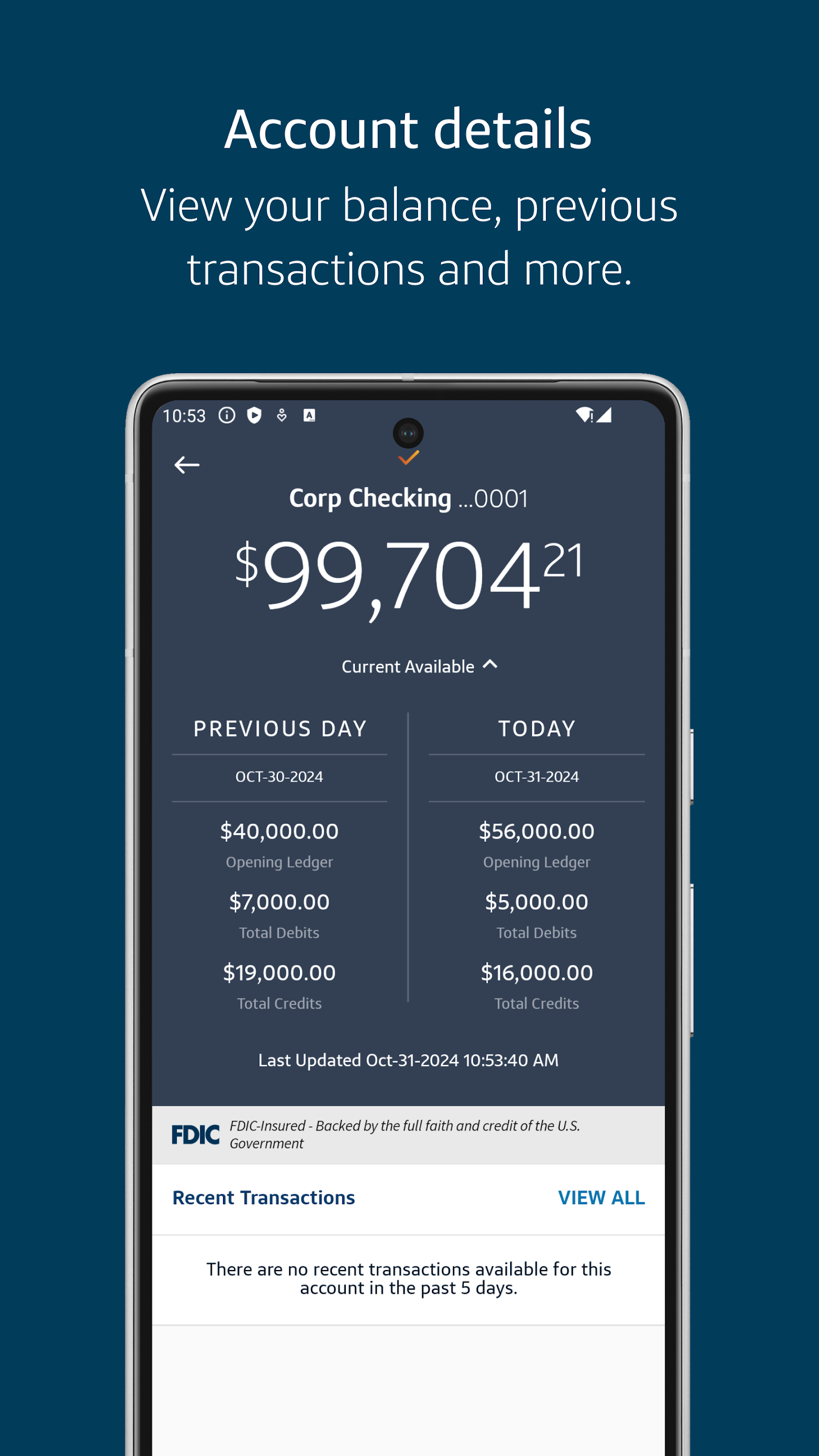
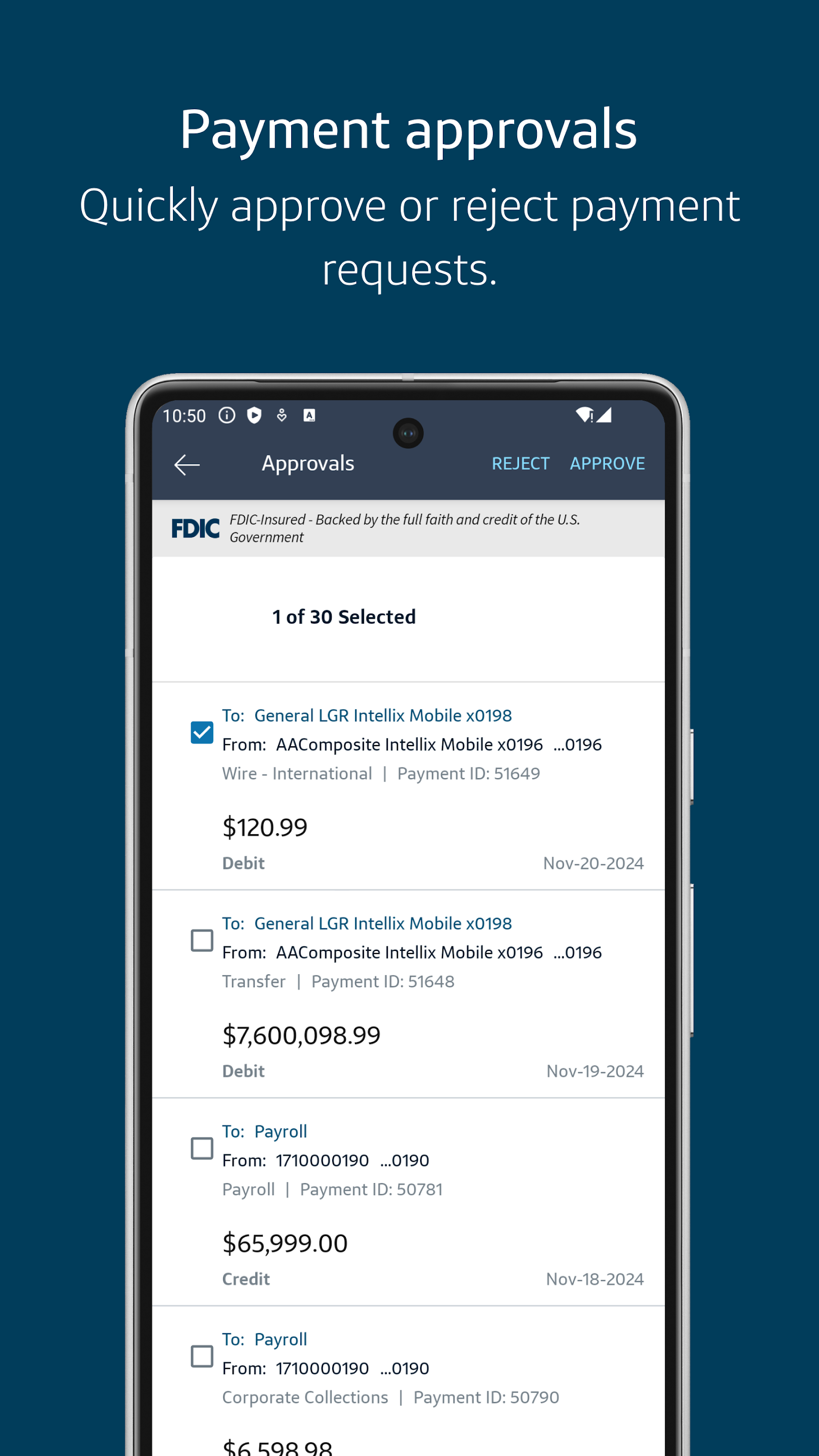
EASE, the design system this engagement extended for enterprise mobile and tablet use (see the ICCE Web track for that work), carried forward into Intellix Mobile, Capital One's current commercial servicing app. Shena Yoshida, mobile engineer, built out that continuation.
Four disconnected tools, four different design languages
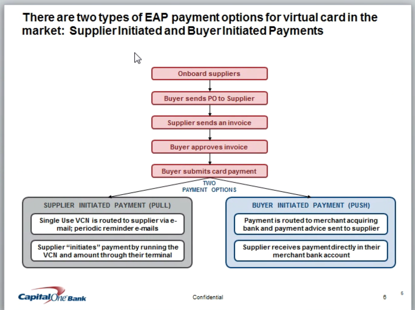
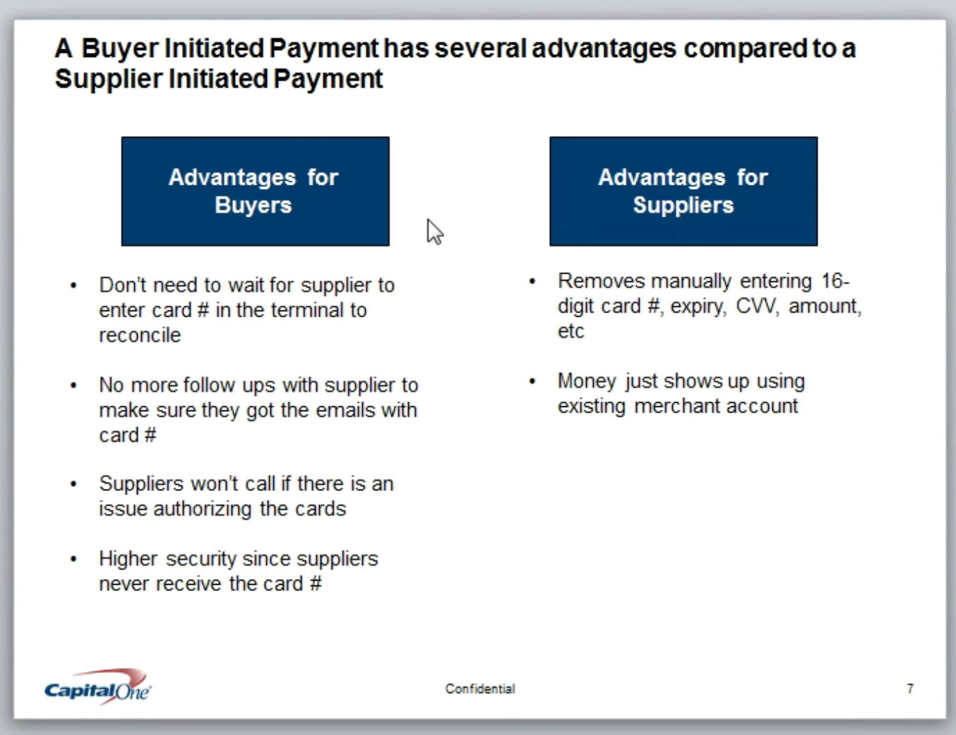
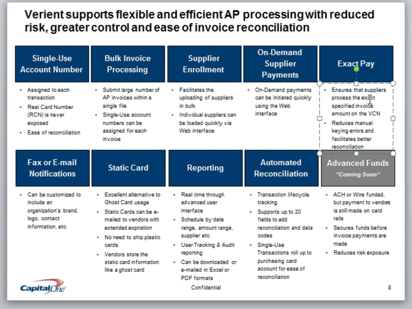
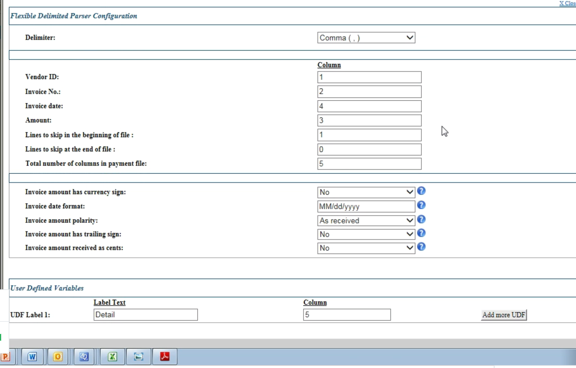
Before the redesign, Capital One's commercial card customers moved between four separate legacy platforms, each with its own visual language, navigation model, and interaction patterns. Screens below are original ICCE production UI from 2016, captured before this engagement's IA and design system work unified them into a single coherent product.

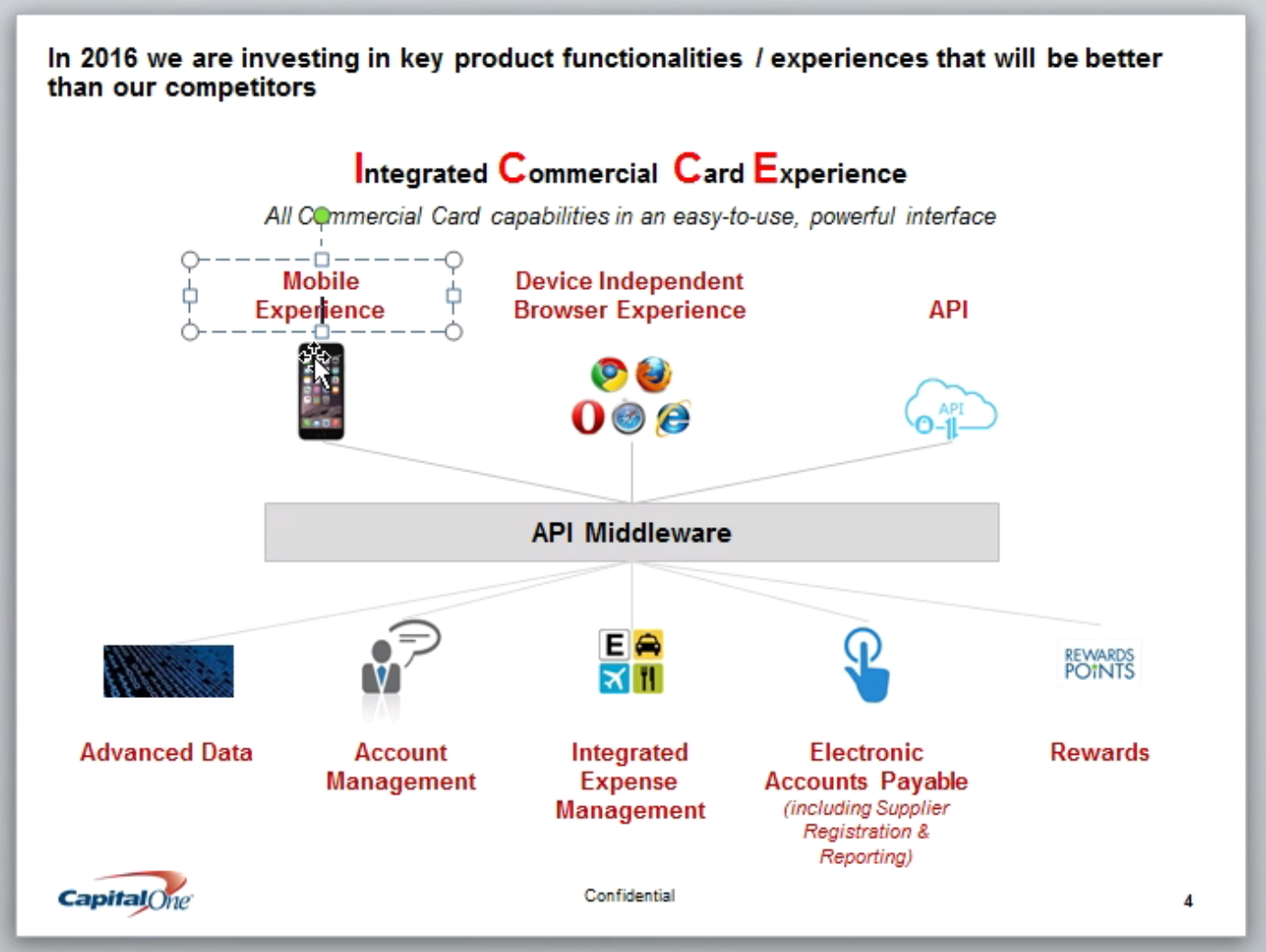
Unifying four disconnected tools into one platform
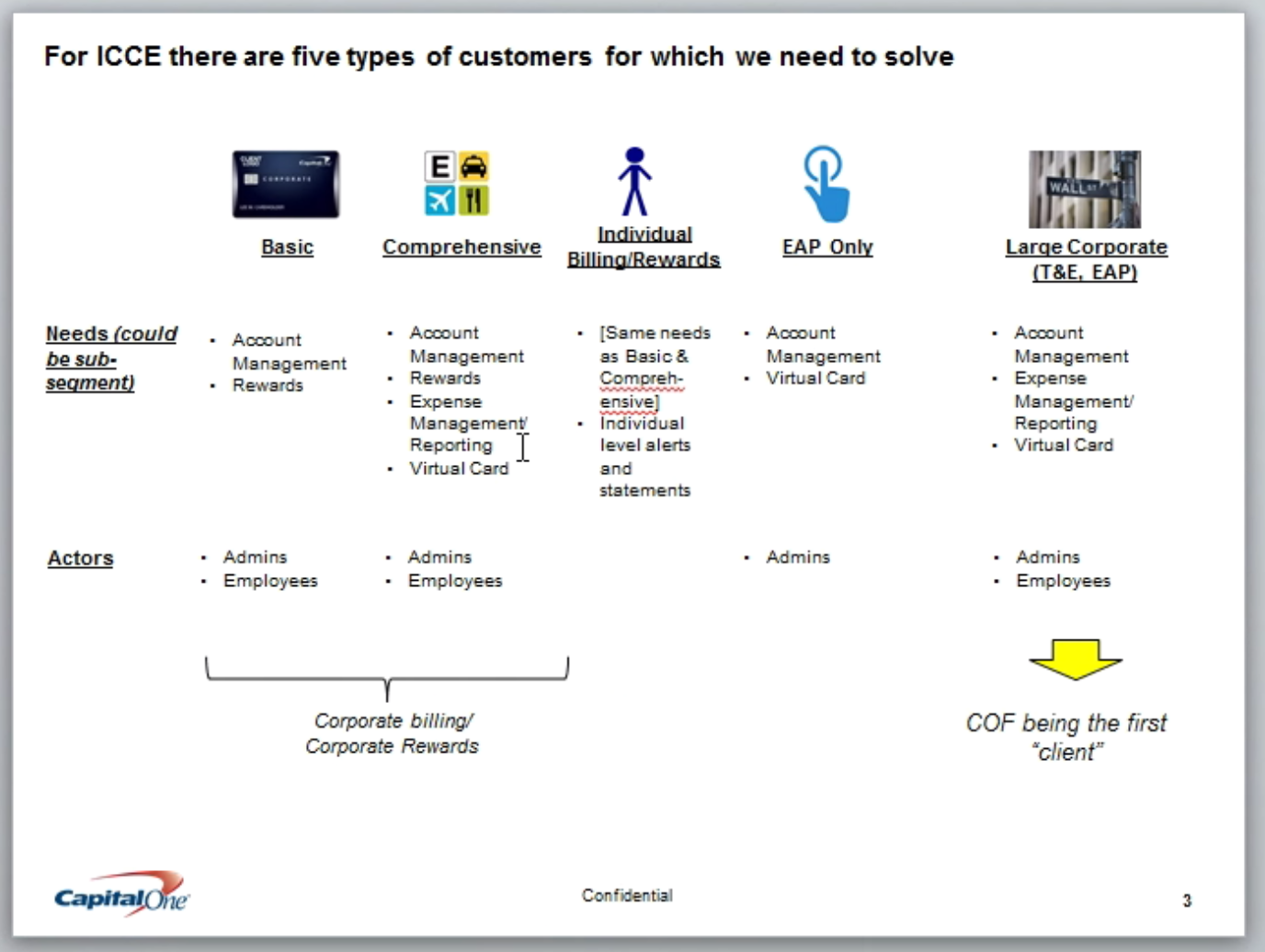
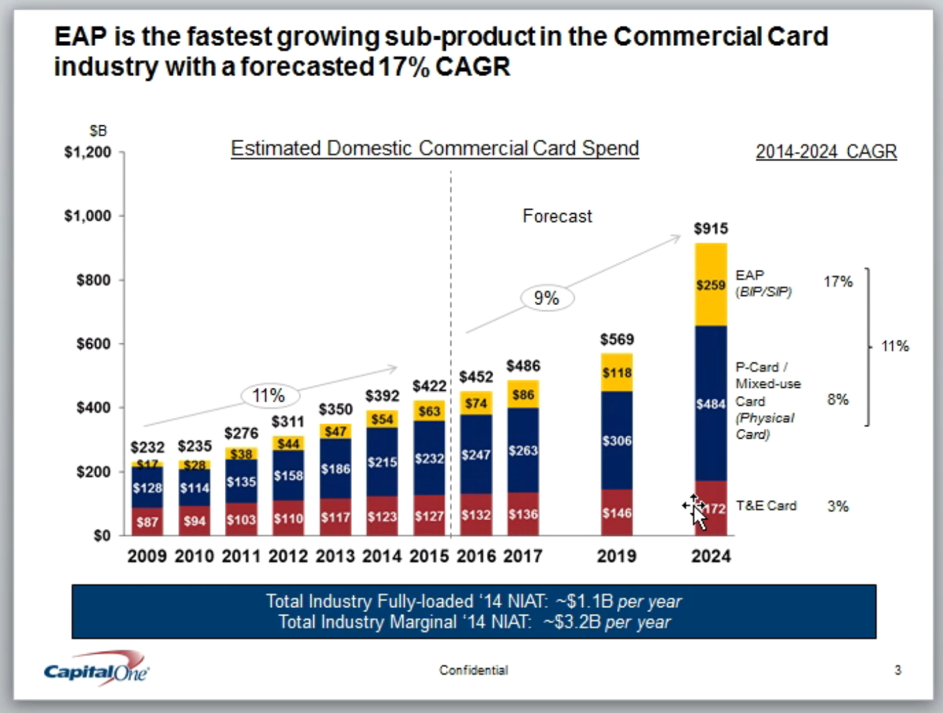
Before ICCE, Capital One's commercial card customers had to stitch together four separate platforms just to manage their account, rewards, expenses, and virtual card program. EAP (electronic accounts payable) was the fastest-growing sub-product in the commercial card industry at the time, forecast at roughly 17% CAGR, and the fragmentation was actively costing ground against dedicated competitors like Verient.
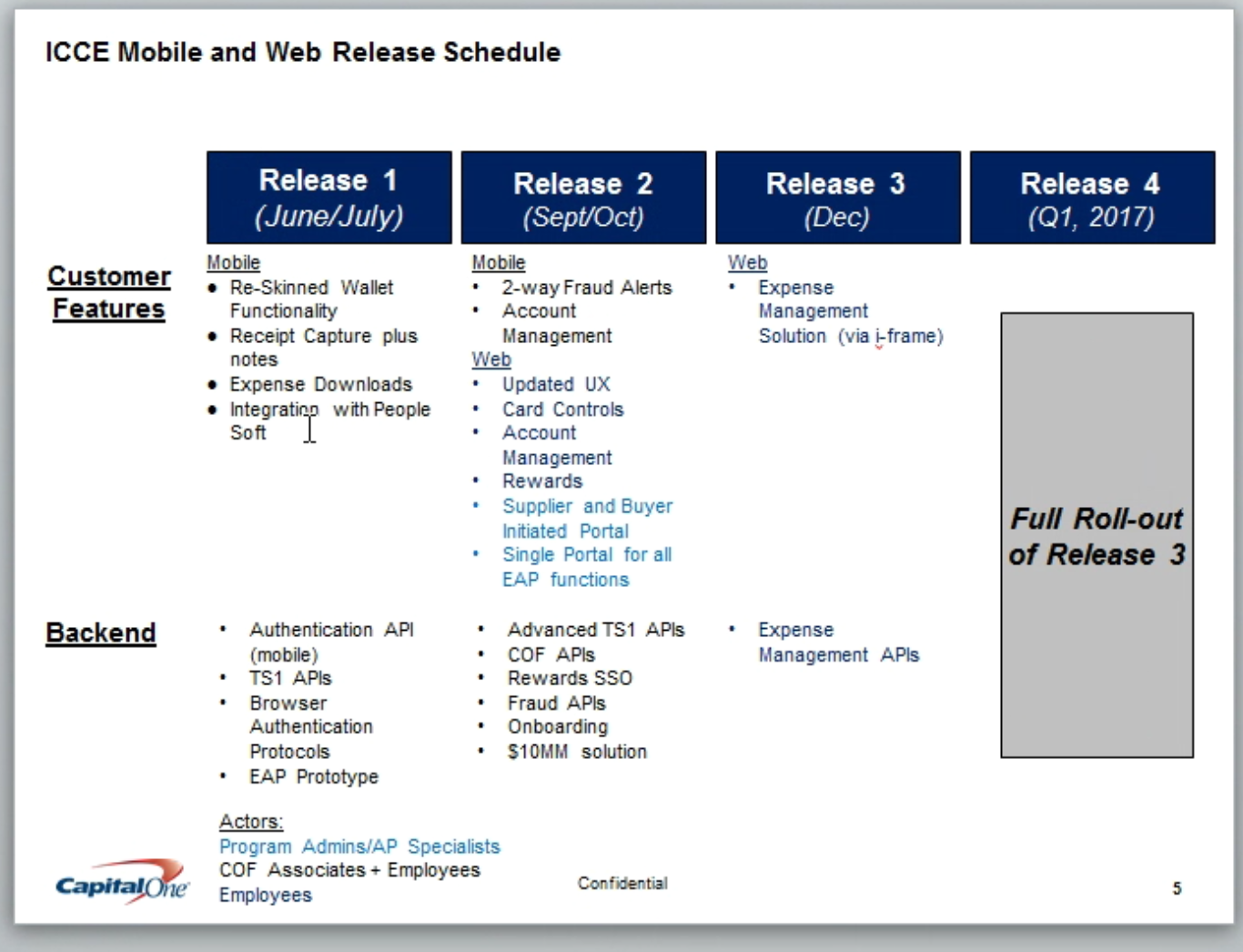
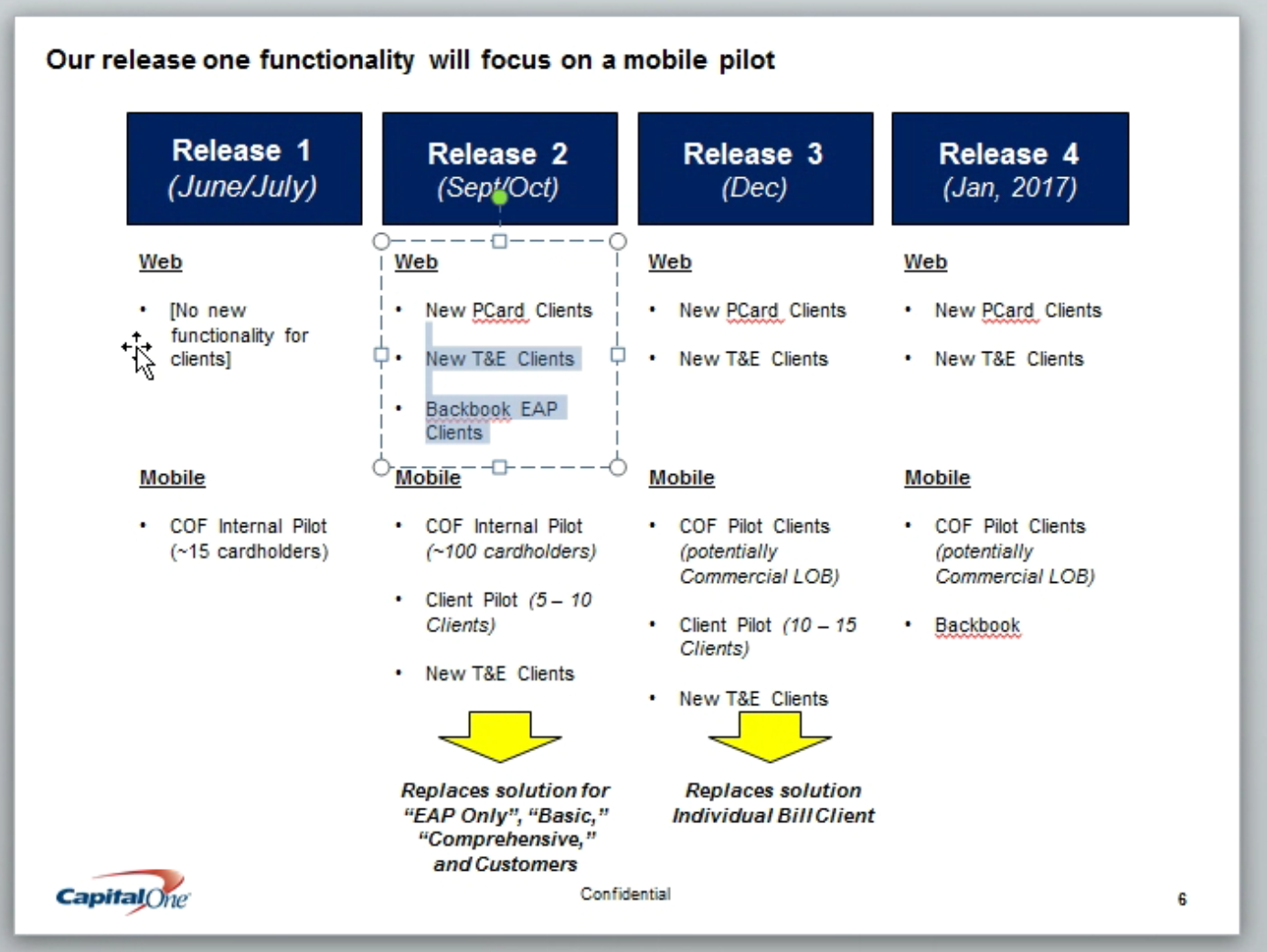
ICCE Web was the fix: one integrated commercial card experience serving five distinct customer segments, from Basic self-service accounts to Large Corporate clients running full T&E and EAP programs, across roughly 3,700 clients. The rollout ran across four releases, starting with a mobile pilot and building to the full platform. It sat under a 5-year B2B payables strategy written by Fouad Alkisswani, then Director and Head of Commercial B2B Product Strategy & Digital Channels. He secured $100M+ in CEO-level investment for it. The platform this work fed into went on to post 30% CAGR revenue growth over the following two years.
Three sides of one platform
ICCE Web had to serve three audiences at once. The buying company, covering basic users, program admins, and Capital One's own issuer-side view. The vendors receiving virtual card payments. And Capital One's internal servicing teams. I mapped the full site structure across all three before any screen got designed, so navigation, permissions, and content ownership were settled up front instead of getting renegotiated screen by screen.
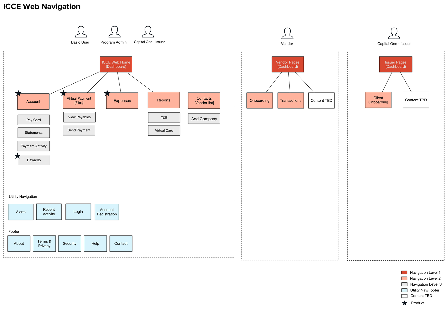
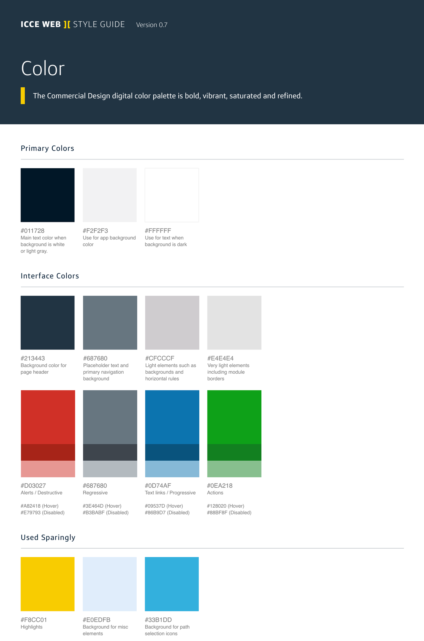
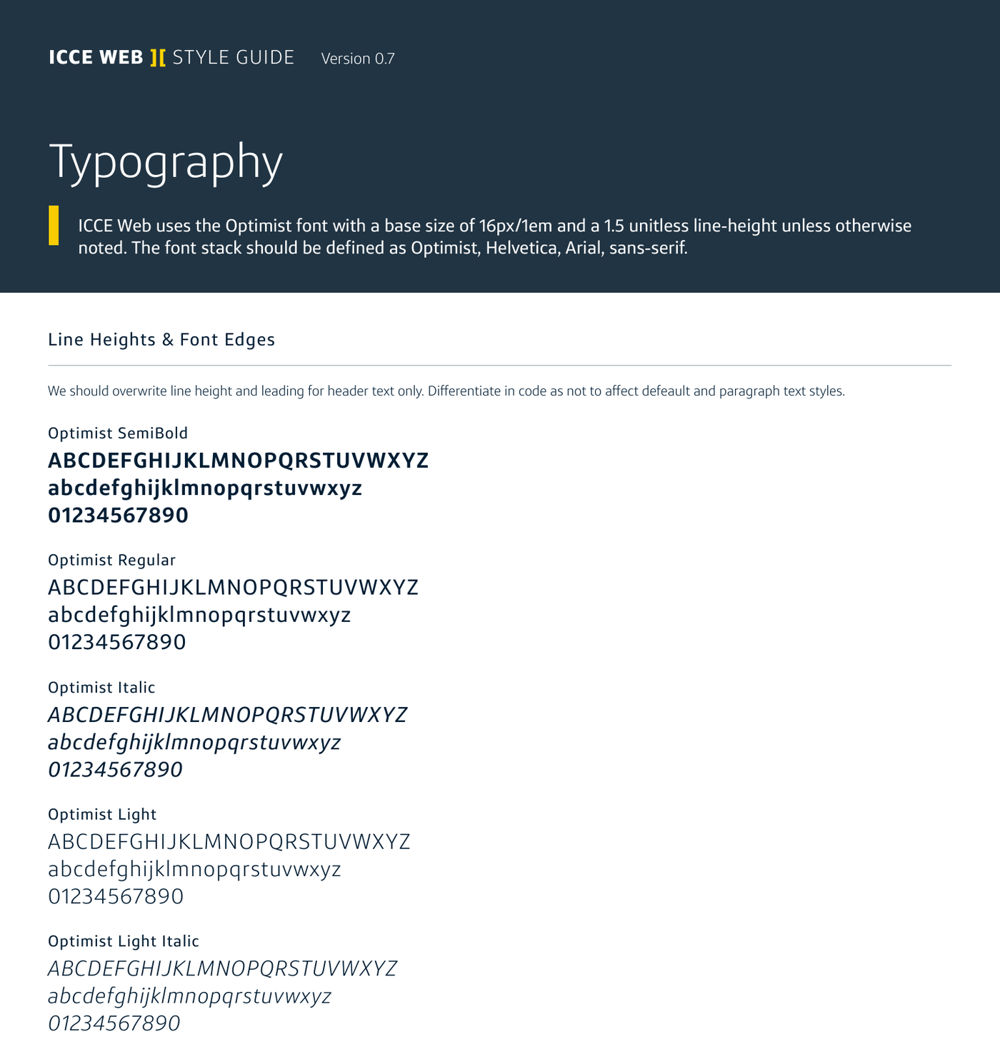
Alongside the IA, I contributed to the ICCE Web style guide: an atomic system of color, typography, icons, and components (forms, alerts, modals, data visualization) built so the product could scale consistently across every release. The team ran on an agile PI (Program Increment) and sprint cadence, with a formal design QA pass at the end of each cycle. One pass alone tracked 75 polish items across the Add Vendor, Pay Vendor, and Dashboard flows.
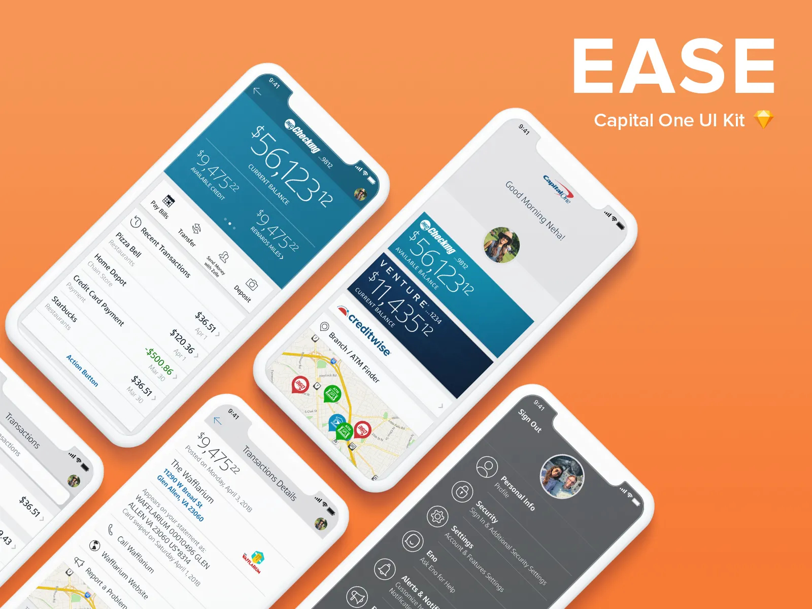
We didn't build the mobile and tablet layer from scratch. We extended EASE (Enterprise Account Servicing Experience), an existing Capital One design system, adapting it for enterprise and B2B use on smaller screens. ICCE's servicing experience kept the same component language across every screen size instead of forking into a parallel system. Neha (Sohail) Hiatt led that work.
From annotated wireframe to shipped screen
The Payables flow is where a buying company tracks, filters, and pays vendor invoices by virtual card. It went through detailed annotated wireframes before any visual design: filter relationships, search field weighting, virtual card issuance and cancellation, and every payment status from Pending through Accepted, Declined, and Expired.
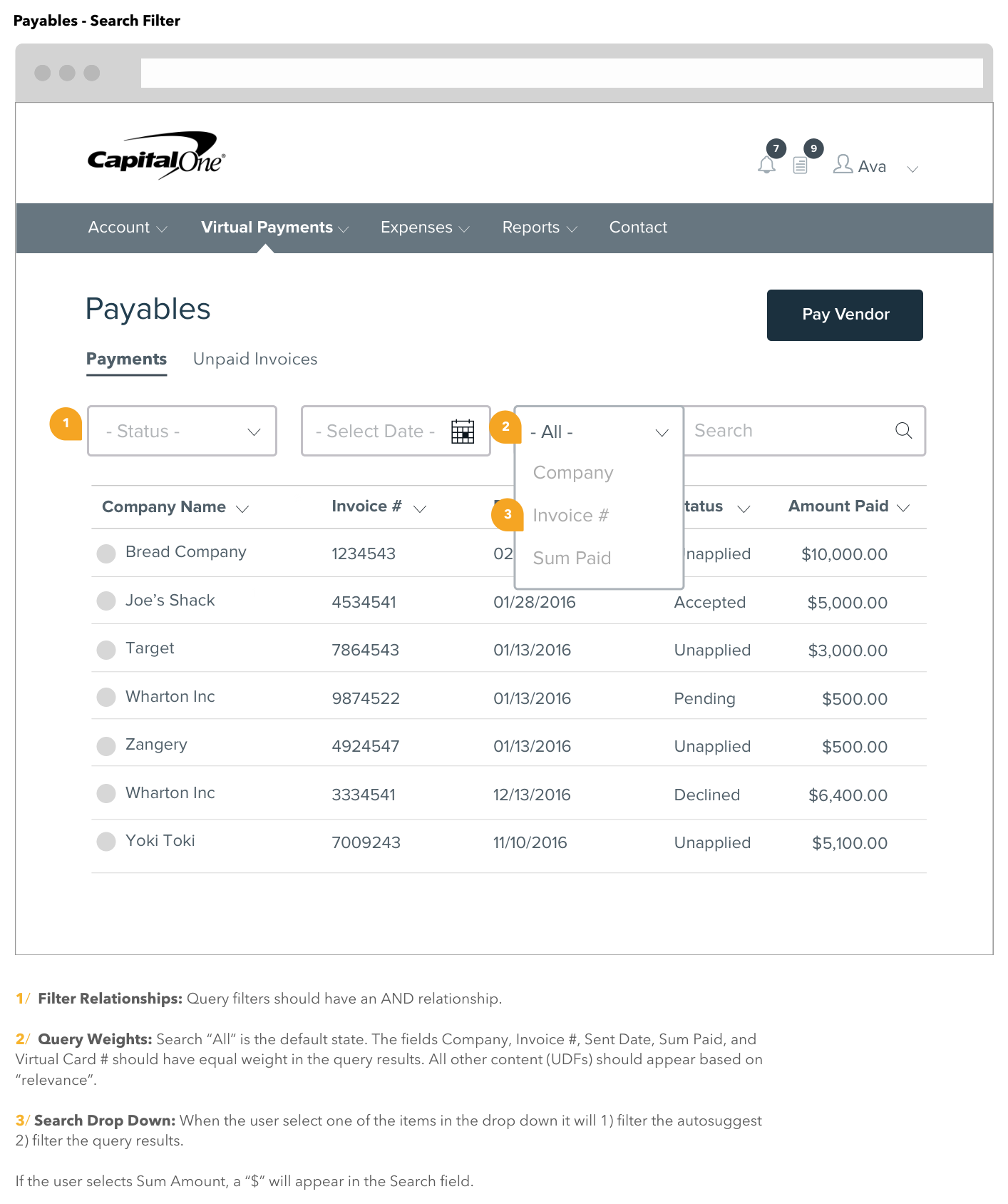
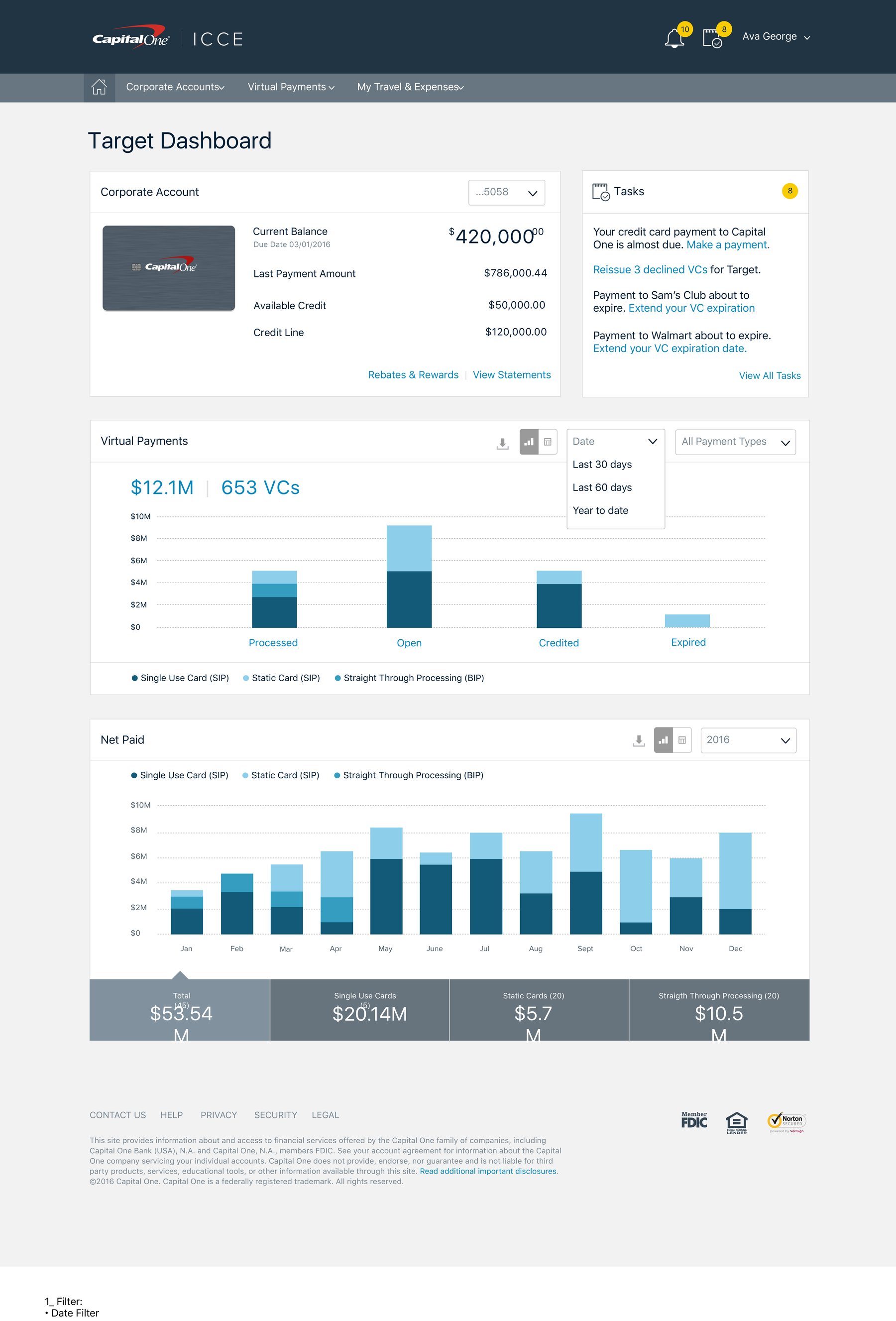
That specification work fed directly into the final product. Buying companies got one dashboard for every virtual payment (processed, open, credited, expired), net paid over time, and outstanding tasks like expiring cards or declined vendor payments.
Giving admins control over who has access
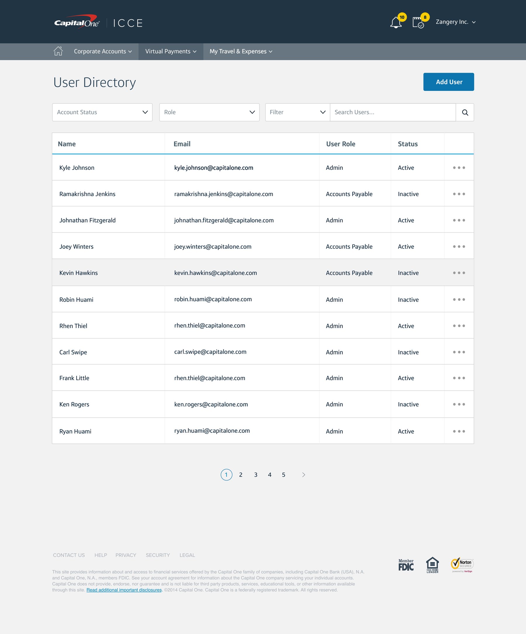
Program admins needed control over who on their team could see and act on payments. So I designed the full user management flow: a searchable directory, adding and onboarding new users, editing roles and permissions, and unlocking, deactivating, and reactivating accounts. Each one got its own confirmation state, with one-time-PIN verification on the sensitive changes.
The credit card, radically redesigned
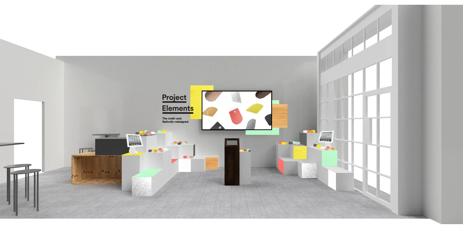
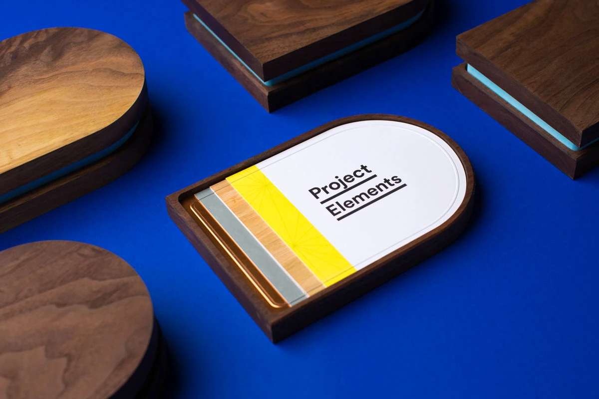
Project Elements by Capital One Labs was the most ambitious work I contributed to during this engagement. The premise: the credit card is a physical object you carry every day. It should feel like it belongs to you, not your bank.
The credit card is a physical object you carry every day. It should feel like it belongs to you, not your bank.
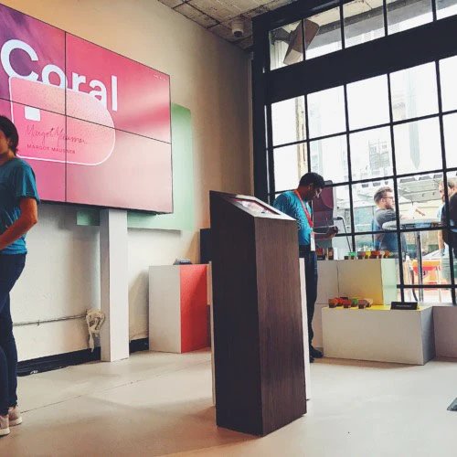
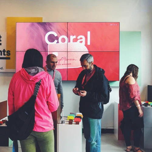
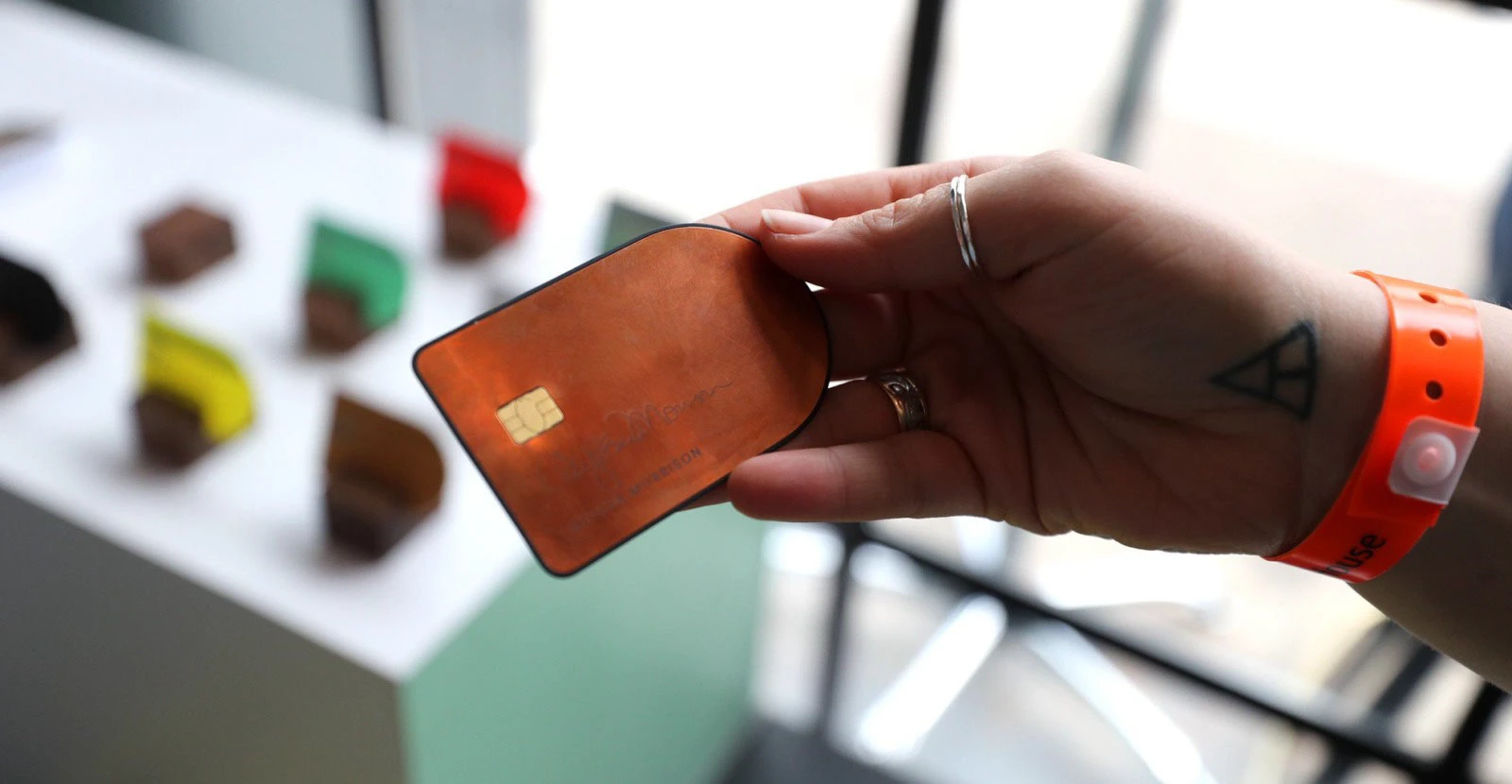
The project reimagined every aspect of the card: its shape, material (bamboo, copper, hammered metal, and other finishes across 12 materials and finishes total), and visual identity, free of traditional card branding. Cards had names: Bamboo. Coral. Lemon. Each told a story about the person who carried it. 💳
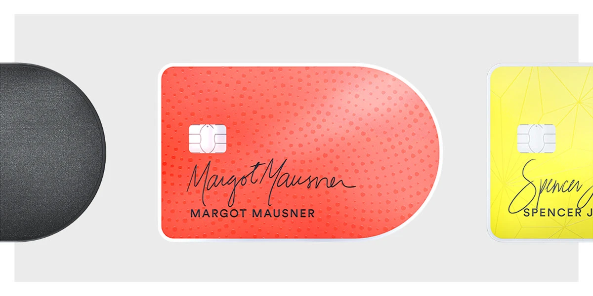

It launched as the Capital One House, a physical installation at Antone's in Austin during SXSW 2017. A modular, gallery-style space where roughly 12,000 attendees handled card prototypes and explored the materials up close. Financial product design that treated the cardholder as a creative collaborator.
Banking meets hospitality
I contributed UX strategy to the Capital One Café initiative, the bank's flagship physical-meets-digital experience designed to make financial services approachable and community-oriented. I helped design the welcoming kiosk experience and ambient digital displays, reinforcing the "everyone's welcome" positioning at every touchpoint.
The same divide the research surfaced, still live today
Years later, Capital One's commercial and business card experience still splits along nearly the same line our research mapped. Dedicated portals like Commercial Card Connect and Intellix give corporate admins the spend controls, virtual card issuance, and AP oversight our Decision Maker and Web personas needed. The standard mobile app carries the lighter, on-the-go card management our Mobile T&E personas wanted. Different products now, but the same underlying divide we designed around then.
That same design rigor carried into other tracks running alongside mine. Lauren Howell, a design peer from the same era, later patented a visual UX system for Capital One Mobile Wallet that reimagined card access and onboarding for 1M+ users.
It shows up in how people talk about Capital One's apps today. a usability teardown of the Capital One Mobile app and a recurring sentiment on Reddit land on the same praise: "capital one's entire online system is heads above any of the other multiple institutions I bank with... everything is set up clearly, intuitively", one Redditor's summary of the consumer app, a different product than the commercial platform I worked on, but built inside the same design organization and culture.
On designing for the full spectrum
The widest range in this project wasn't the number of platforms, it was the users. A Director of IT protecting his reputation with a spotless expense report and a tile installer fronting her own money because she has no corporate card at all are both "T&E users," but they needed almost nothing in common from the product. Good enterprise research means resisting the urge to design for the average of that range, because the average user doesn't exist. 🔍